You are using an out of date browser. It may not display this or other websites correctly.
You should upgrade or use an alternative browser.
You should upgrade or use an alternative browser.
[4.5.6] Rad Rabbit's Bad Hare Day - (WIP)
- Thread starter Jonny
- Start date
Jonny
Well-known member
Yeah, I was thinking that about palettes. I'm not going to have much variety in monsters for each level though. The bosses might end up looking a bit plain without many spare colours.the hud looks amazing but it uses 3 of your 4 pallets for sprites, gonna have to be really resourceful with your monsters, also the animations are amazing aswell
Thank you, I like how the animations are turning out. The player looked a bit stiff before. Although, 8 frames for running and idle really starts to eat up on graphics space...
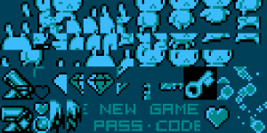
I'm not going to have DUCK anymore, so that will free up a few tiles. Probably be able to trim a few more as I figure things out.
Jonny
Well-known member
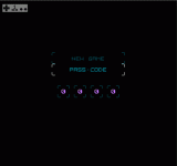
Done a little bit more on the passcode menu.
Getting it to scroll through numbers and store them as variables, then check against them for warps will be hard for me to achive.
Tbh I'm not completely sure how to go about it. It seems like something that would benefit from data arrays but I don't know how to do that.
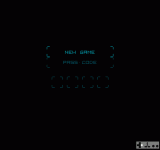
Getting it to scroll through numbers and store them as variables, then check against them for warps will be hard for me to achive.
Tbh I'm not completely sure how to go about it. It seems like something that would benefit from data arrays but I don't know how to do that.

casperdj777
New member
this looks really cute
Jonny
Well-known member
It's mostly based on yours and Mugi's code from tutorials. That's why it hasn't been too difficult so far. If you have any advice for a good way to scroll through numbers or letters and store them, that would really help.Haha !! Great work, so far
I've been working on a grabtile that lets player jump off it (like DuckTales etc) and object trajectories too. Getting to the point we're I really need to be learning the nes hardware, ASM and banks properly.
5kids2feed
Well-known member
Jonny
Well-known member
I've been working on a more dynamic run animation but I think I prefer the old one, not sure. Need to try them out in the game before deciding. What do you think? The newer one probably needs a few tweeks.
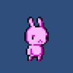

Another consideration is the extra sprites the new one uses. Not sure it's worth losing that gfx space.


Another consideration is the extra sprites the new one uses. Not sure it's worth losing that gfx space.
5kids2feed
Well-known member
I prefer the old one as well. Gives it that extra little something.
mouse spirit
Well-known member
I remember dale_coop saying that maybe when he had some time, after the byte -off, he could maybe share how heIt's mostly based on yours and Mugi's code from tutorials. That's why it hasn't been too difficult so far. If you have any advice for a good way to scroll through numbers or letters and store them, that would really help.
I've been working on a grabtile that lets player jump off it (like DuckTales etc) and object trajectories too. Getting to the point we're I really need to be learning the nes hardware, ASM and banks properly.
did the name / letter selection for his spray paint game. Which would be awesome!
Jonny
Well-known member
Short Update Video...
Not a great deal of progress to be honest in this video. I've started messing about with monsters and actions. They're a long way off what I want but I'm happy with how objects load / look at screen edge and without duplicating. I'm still on the fence about more complex player animation or the original simpler one I had before. Most levels background graphics are done for the main part but I'll only be showing the dungeon backgrounds from now on so not to spoil anything for anyone who wants to play the finished game. I'll be doing a demo at some point, but at the moment there's no actual gameplay really, just a dumb rabbit running about bumping into stuff.
View: https://youtu.be/iU3BVybgIdo
What I'm working on next...
More realistic fireballs - I've been trying to get fireballs to slow down at the top/apex or get something a bit nicer than simple blasting up, then blasting down. I got as far as being able to manipulate the maxspeed with an action step flag, but my problem is that it wont change if the object is already going in that direction. If I have 2 action steps in sequence for moving up, the second action will ignore the flag to change the maxspeed because the object is already moving in that direction. Speed only changes if I change direction too. Something to do with what and where I'm trying to change it in the physics script.
Score that actually works - Also need to shoehorn in the number graphics somewhere!
Attack mechanic for player - Still unsure if I want something simple like 'jump on head' to kill monsters or something a bit more unusual.
Add more interest/variety to backgrounds - There's a bit of graphics space left for most levels. I wan't to keep the palettes really basic but find a way to add interest in different sections. I've got some palette cycling effects done but trying to not overdo them. Might only be on a few levels and rarely used.
That's about it at the moment. Its a very slow project compaired to the speed others and getting games finished. I might do a little side project single screen game. Most of my headaches and limited time spent are to get things to work with the scolling. Possibly a mistake for a beginner but I'll stick at it. Chipping away at it slowly!
Not a great deal of progress to be honest in this video. I've started messing about with monsters and actions. They're a long way off what I want but I'm happy with how objects load / look at screen edge and without duplicating. I'm still on the fence about more complex player animation or the original simpler one I had before. Most levels background graphics are done for the main part but I'll only be showing the dungeon backgrounds from now on so not to spoil anything for anyone who wants to play the finished game. I'll be doing a demo at some point, but at the moment there's no actual gameplay really, just a dumb rabbit running about bumping into stuff.
What I'm working on next...
More realistic fireballs - I've been trying to get fireballs to slow down at the top/apex or get something a bit nicer than simple blasting up, then blasting down. I got as far as being able to manipulate the maxspeed with an action step flag, but my problem is that it wont change if the object is already going in that direction. If I have 2 action steps in sequence for moving up, the second action will ignore the flag to change the maxspeed because the object is already moving in that direction. Speed only changes if I change direction too. Something to do with what and where I'm trying to change it in the physics script.
Score that actually works - Also need to shoehorn in the number graphics somewhere!
Attack mechanic for player - Still unsure if I want something simple like 'jump on head' to kill monsters or something a bit more unusual.
Add more interest/variety to backgrounds - There's a bit of graphics space left for most levels. I wan't to keep the palettes really basic but find a way to add interest in different sections. I've got some palette cycling effects done but trying to not overdo them. Might only be on a few levels and rarely used.
That's about it at the moment. Its a very slow project compaired to the speed others and getting games finished. I might do a little side project single screen game. Most of my headaches and limited time spent are to get things to work with the scolling. Possibly a mistake for a beginner but I'll stick at it. Chipping away at it slowly!
JollyShadow
Active member
Let me just say Jonny that is a fantastic tile set, It does a really good job. Like I'm scared of having a background that takes away from my character so I made it pure black, but you made a full tile background with a wonderful use of contrasting colors.
Jonny
Well-known member
Thanks dude. I made a conscious decision to not use black in the backgrounds (or at least in the playable area) and have regretted that a few times but sticking with it now. The idea was that pickups, monster outlines and the exit doors would be very clear black, high contrast. I'm finding woodland stage the most difficult but the others have worked out ok. Glad you liked it. I keep tweeking stuff, done a couple more tiles since posting the video.Let me just say Jonny that is a fantastic tile set, It does a really good job. Like I'm scared of having a background that takes away from my character so I made it pure black, but you made a full tile background with a wonderful use of contrasting colors.
CluckFox
Active member
I think this looks really good, glad you stuck with it. When I saw the demo video the "crispness" of the outline effect really jumped out at me.I made a conscious decision to not use black in the backgrounds (or at least in the playable area) and have regretted that a few times but sticking with it now
Jonny
Well-known member
I've been doing a bit of work on the password system. I know that saving is possible but I feel like I'm learing more doing something I understand (coding wise) for now at least. After a few failed attempts, I'm heading in the right direction. I've got four stored variables which user can change with RIGHT and B-Button.
Next, I need to do the warping part which checks the stored variables and sends player to the corresponding level.
There are 16 possibilities for each of the 4 code numbers. I'm not sure if that's enough or not but I can add more. It's a question of using up graphics space for the numbers/letters rather than how its coded. I don't want players getting codes correct by accident or by going though them in seqence. Math is not my strong point so I don't know the probability of that. Probably doesn't matter too much?
